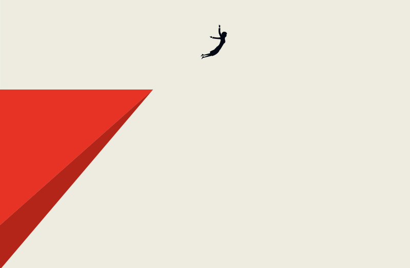
We’re dedicating today’s blog to minimalism, the design style that’s sweeping the internet. From crystalline shapes to bold color blocks, responsive design has brought minimalism back into the foreground. (If you’re unfamiliar with responsive design, click here to learn more about it). Before we dive into the reasons for minimalism’s success in the era of tablets and cell phones, however, let’s take a closer look at minimalism’s evolution. That’s right folks! It’s time to take a brief lesson in one of our agency’s favorite subjects: art history.
A Minimalist History of Minimalism
Minimalism may be very popular now, but its clean design style is far from new. In fact, the building blocks of minimalism appeared in the early 1900s with the Dutch De Stijl group (click here to learn more). Later, artists like Frank Stella brought minimalism to the galleries at the Museum of Modern Art in the 1960s and 1970s.
Stella’s work, and that of other minimalists, introduced new aesthetic principles. Instead of art imbued with symbolic meaning, they celebrated literal art. Minimalist art was meant to produce an immediate response with simple forms, colors, and materials. Some popular characteristics of minimalist art include two dimensional shapes, geometric forms, repeated patterns, solid color blocks, and white space.
Minimalism in Responsive Design
You may recognize some of these characteristics from websites by leading companies like Microsoft (click here to see Microsoft’s use of geometric forms), Spotify (click here to see Spotify’s use of white space), and Adobe (click here to see Adobe’s use of two dimensional shapes). As you can see, minimalist design is dominating the 21st-century world wide web.
In today’s tech-driven world, it’s no surprise that minimalism is experiencing restored success. Mobile phones account for nearly 50% of website traffic. If you think of your website as your company’s chef-d’oeuvre, that means its canvas is generally the size of your palm. Responsive design makes it possible for websites to maintain their aesthetic value as they scale from large desktops to mobile phones. To do so, it relies upon minimalist techniques like empty space, hidden navigation bars, and two-dimensional graphics.
Responsive Design Matters
Minimalism facilitates two important goals of responsive design. First, it enables us to better direct visitors’ attention to a given call for action, such as “Subscribe to our newsletter,” or “Check out our blog!” Whether visitors are browsing on a desktop, a tablet, or a cell phone, minimalism keeps web design clean and uncluttered.
Second, a minimalist design improves load time and decreases bounce rate. A rapid load time is crucial: bounce rates increase by 100% with a 2 second delay in load time. Minimalist, responsive design both attracts visitors to your site and keeps their attention once they arrive.
For more information on the benefits of responsive design, call us today. If you’re lucky, we’ll even throw in an additional art history fact free of price.